Distinct
Elevated
Impactful
Cohesive
Different
Bold
Creative
Powerful
Bold

Studio Ealain
Brand Design | Print Design
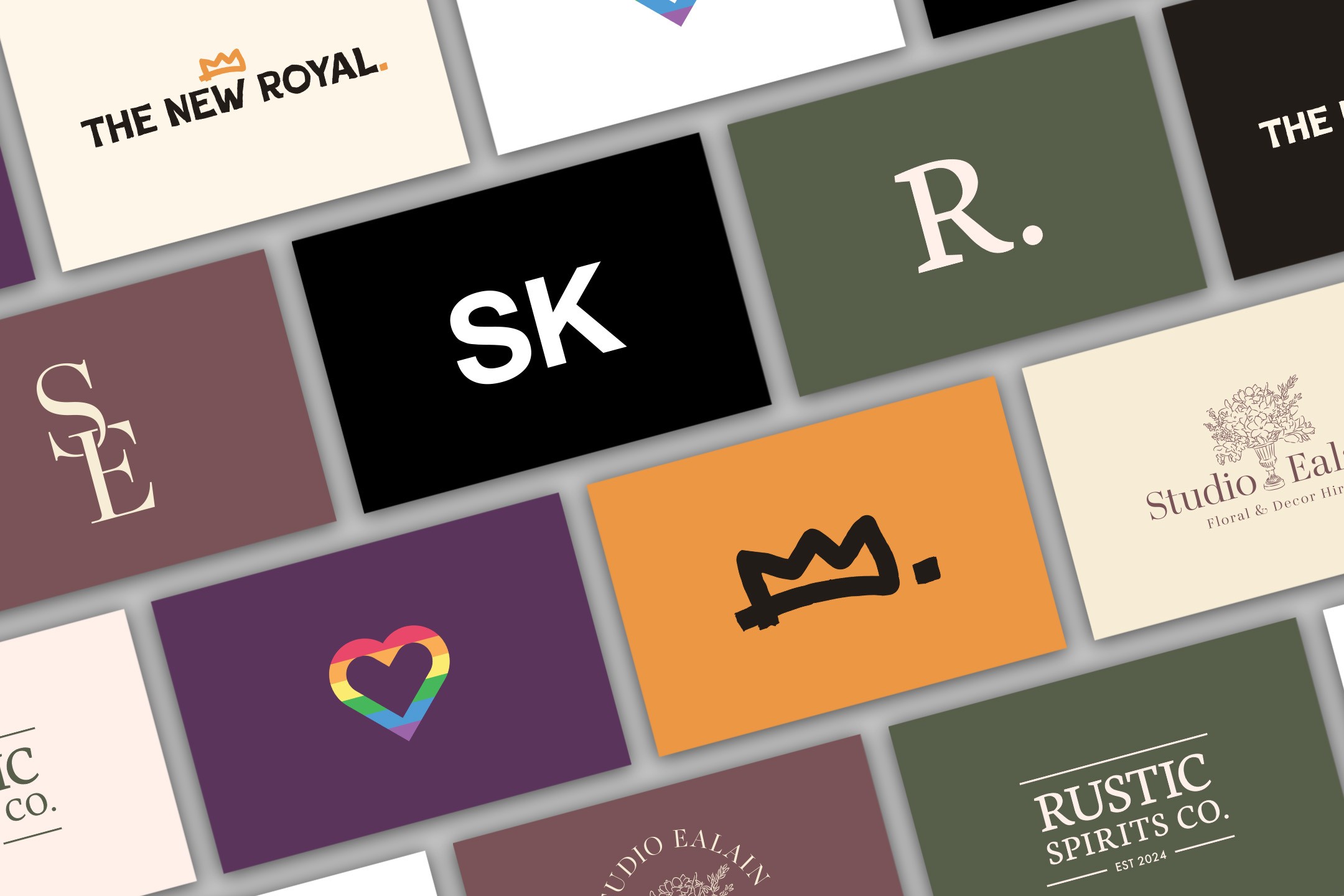
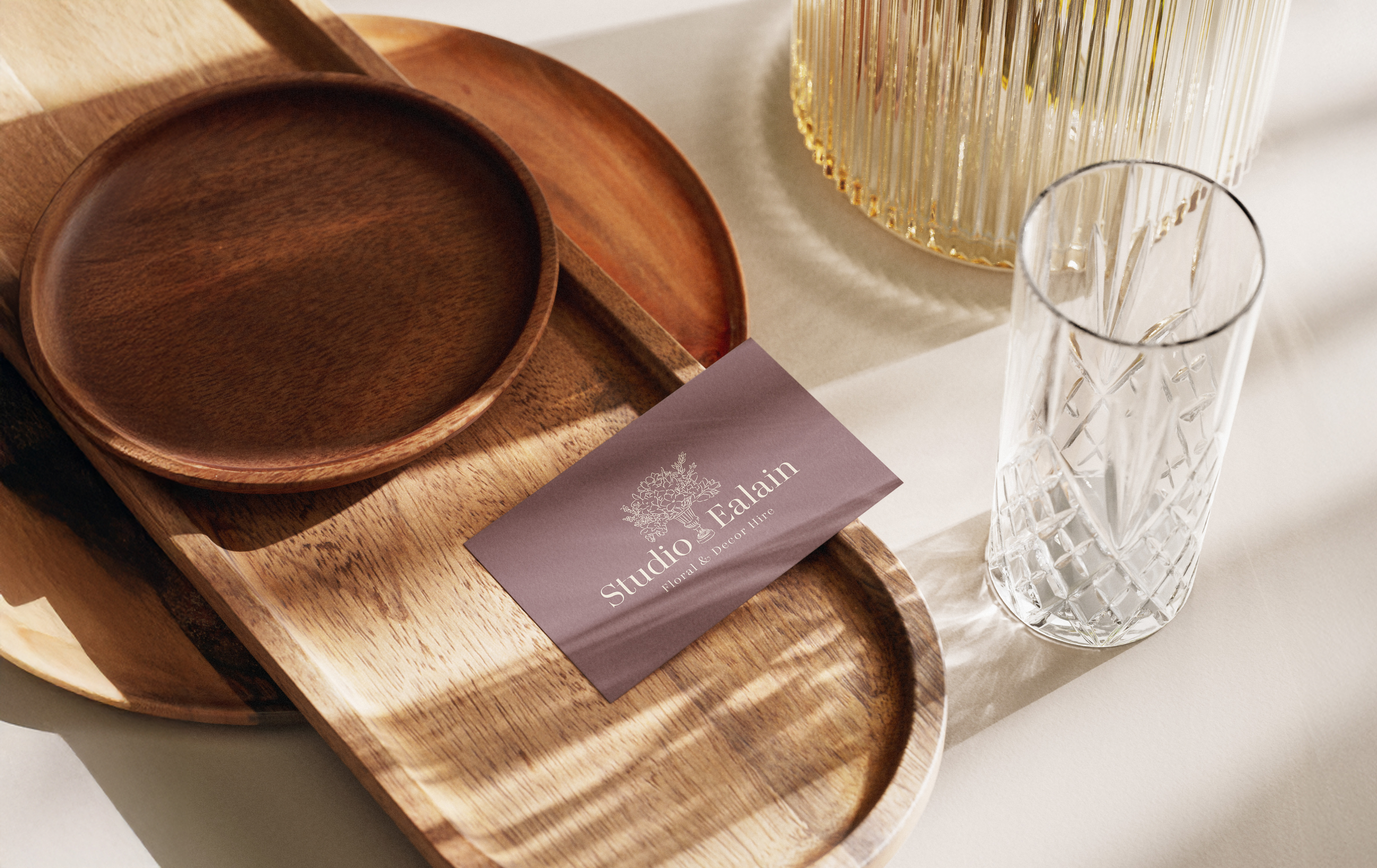
Studio Ealain is a new brand, focused on delivering luxury quality floral arrangements and decorations, for events and weddings, at a very competitive price point. We achieved the visual balance between class, and affordability by pairing a very elegant type face with an imperfect but still beautiful floral illustration style.
Read case study

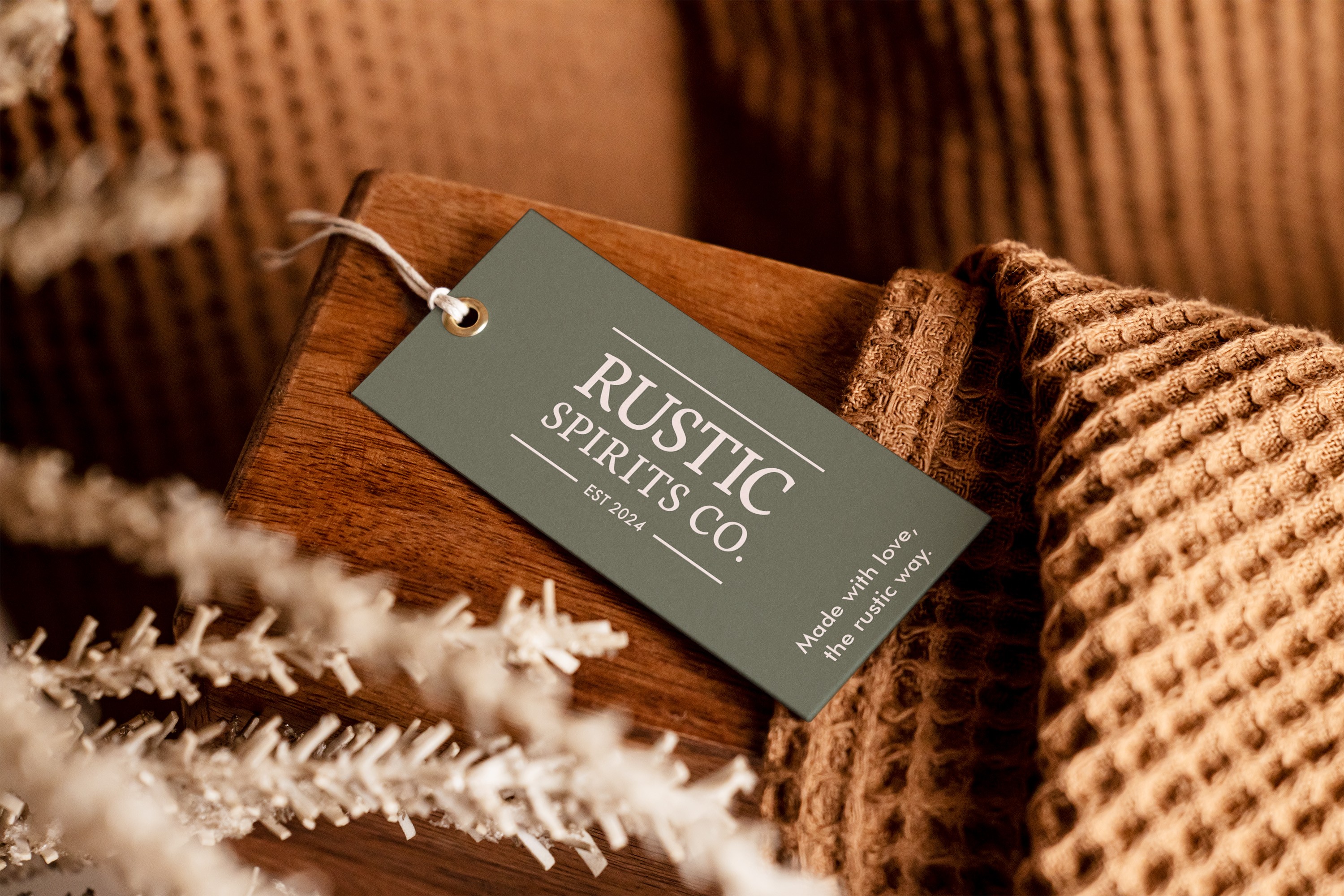
Rustic Spirits CO.
Brand Design | Social Media | Packaging Design
Rustic Spirits Co. is a Digital Content Producer and Distillery, with a focus on farming, sustainability, and nature. They tried for a while to find a logo style that could evoke the feeling of authenticity and nostalgia without any luck, leading to unclear identity, values and mission. By focusing on the classic feel, while trying to keep things modern, we were able to dial in the identity of this new-old brand.
Read case study

Studio Kirby
Brand Design | Social Media | Print Design
Studio Kirby has been a staple of the school photography scene in south east Queensland for over 35 years, and hadn’t had a proper full rebrand in about 20. A lot of logos were slowly evolved over time without keeping in mind a full system that could work together cohesively. SK wanted a new brand that felt simple and strong, to convey the feeling they want to provide their clients, and customers.
Read case study

Heart Wear
Brand Design | Social Media | Print Design
Heart Wear is a clothing and apparel brand focused on normalising LGBTQ+ identities, and relationships. The worry with this brand was very clear. Many companies try to make pride apparel that feels inauthentic or “Too Much”. Heart wear wanted to set themselves apart by making sure to keep things looking timeless, clean, and simple.
Read case study


Distinct
Elevated
Impactful
Cohesive
Different
Bold
Creative
Powerful
Bold
Studio Ealain
Brand Design | Print Design
Studio Ealain is a new brand, focused on delivering luxury quality floral arrangements and decorations, for events and weddings, at a very competitive price point. We achieved the visual balance between class, and affordability by pairing a very elegant type face with an imperfect but still beautiful floral illustration style.
Read case study

Rustic Spirits CO.
Brand Design | Social Media | Packaging Design
Rustic Spirits Co. is a Digital Content Producer and Distillery, with a focus on farming, sustainability, and nature. They tried for a while to find a logo style that could evoke the feeling of authenticity and nostalgia without any luck, leading to unclear identity, values and mission. By focusing on the classic feel, while trying to keep things modern, we were able to dial in the identity of this new-old brand.
Read case study

Studio Kirby
Brand Design | Social Media | Print Design
Studio Kirby has been a staple of the school photography scene in south east Queensland for over 35 years, and hadn’t had a proper full rebrand in about 20. A lot of logos were slowly evolved over time without keeping in mind a full system that could work together cohesively. SK wanted a new brand that felt simple and strong, to convey the feeling they want to provide their clients, and customers.
Read case study

Heart Wear
Brand Design | Social Media | Print Design
Heart Wear is a clothing and apparel brand focused on normalising LGBTQ+ identities, and relationships. The worry with this brand was very clear. Many companies try to make pride apparel that feels inauthentic or “Too Much”. Heart wear wanted to set themselves apart by making sure to keep things looking timeless, clean, and simple.
Read case study